UGoTour’s first generation native mobile and web applications were experiencing less than ideal user adoption. User research and testing were conducted to asses user needs, expectations and modes.
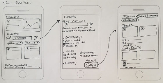
Based on research findings, it was determined that audiences approached the product in a mode of discovery and exploration. The current interface was geolocation-oriented and assumed the user would select options in their current geographic location. [Read about Mobile App User Flow diagraming for this project.]
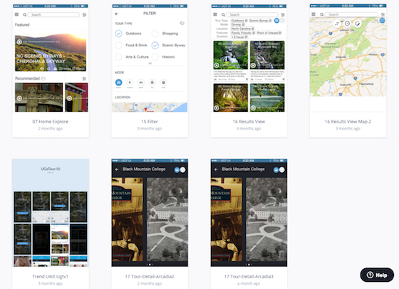
First, content needed to be categorized and tagged so that it could be searched and filtered by users. Next, a new low fidelity UI user flow was wireframed and tested, aiming to facilitate content discovery and exploration. Based on existing analytics and user surveys, it was known that adoption was triggered once users listened to audio content. So the ability to play audio stories was surfaced as a primary means to explore content, from the home screen all the way through to recommended content callouts.
User modes of discovery and exploration drove UI revisions to improve product adoption
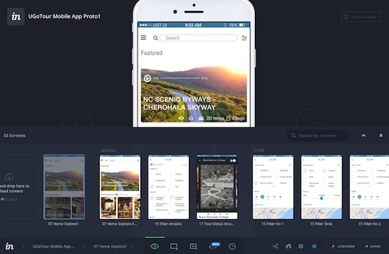
High fidelity screen mockups were designed based on the wireframes and then the app was prototyped in InVision. In addition to further validation testing, the prototype of the next generation app was also used to demonstrate product roadmap and vision to investors and strategic partners.
UGoTour is a content and technology company in the travel and tourism space, helping to connect people with place through storytelling.


