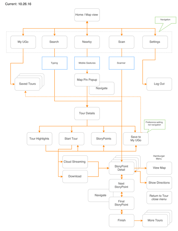
The user flow of the UGoTour native mobile app presented both difficulties and dead ends in navigating to content. The web app was entirely unique and didn’t share any design, navigation or functionality in common with the native app.
The first task was mapping the flow of the first generation app that had evolved organically, based on one-off needs and requests. Navigation didn’t follow standard conventions and a variety of gestures were required, forcing new users to “figure it out” or leave.
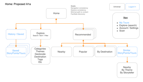
Based on user research, wireframed and mocked up in Mobile App Prototyping, a new user flow was diagramed to facilitate discovery and exploration. Additional goals of the re-envisioned user flow were navigation and gesture consistency, and a minimal path to content.

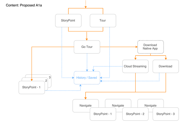
Content was surfaced at the top level, where users could also consume audio content immediately. The requirement to create a user account was removed as a barrier to content and mapped to those features where it was required – saving preferences, history and favorites for example.
Different content types and hierarchy conflicts were also resolved to create a singular flow through the app, navigating users through a familiar and consistent experience each time, including across native and web apps.


